ONE CODEBASE, EVERY SCREEN
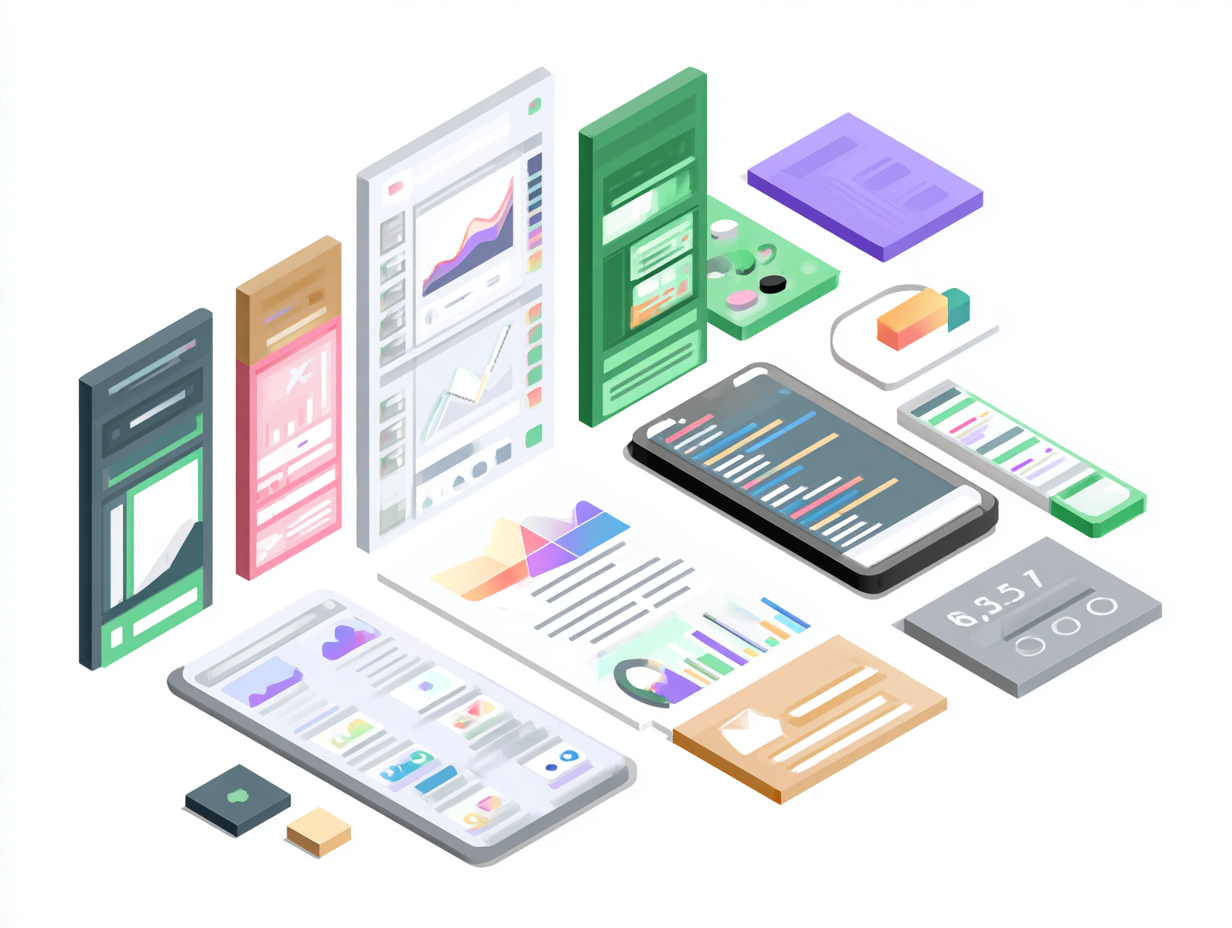
Flutter ships the same rendering engine, widget catalog, and reactive model to iOS, Android, desktop, and now the modern browser. Maintaining a single repository reduces divergent logic, keeps QA cycles tight, and accelerates delivery. With Web reaching stability, teams can confidently promote Dart code to production without rewriting UI layers for HTML/JS.
Treat the browser as a first-class citizen: define shared domain logic, but adapt UI density, typography, and input models (hover, keyboard shortcuts, focus rings) per platform. Flutter's composable widgets and theming APIs make that platform awareness straightforward without duplicating code.
RESPONSIVE DESIGN DEEP DIVE
Start with mobile-first intent, then progressively enhance for tablets and wide desktop canvases. Smaller surfaces force clarity: prioritize primary journeys, trim ornamental widgets, and use async loading states that translate regardless of screen size. When you scale up, you simply add supportive UI instead of refactoring the core narrative.
- LayoutBuilder exposes the current max width/height so you can render alternate widget trees without guessing breakpoints or reading global state.
- MediaQuery delivers device metrics (padding, pixel density, text scale) that inform touch targets, gutter spacing, and typography so the UI feels truly adaptive.
- Combine both to decide when to switch navigation patterns (bottom bar → rail → side nav), reduce column count, or collapse card grids into carousels.
Memoize your breakpoints in a helper widget so product teams agree on what "compact" versus "expanded" means. Consistency keeps design systems sane and lets QA validate once per breakpoint rather than per screen.
A REUSABLE BREAKPOINT HELPER
Drop this widget anywhere you need adaptive layouts. It leans on LayoutBuilder for constraints and MediaQuery for safe-area awareness, keeping logic centralized.
import 'package:flutter/material.dart';

enum ScreenSize { compact, medium, expanded }

class ResponsiveViewport extends StatelessWidget {
  final Widget compact;
  final Widget medium;
  final Widget expanded;

  const ResponsiveViewport({
    super.key,
    required this.compact,
    required this.medium,
    required this.expanded,
  });

  ScreenSize _sizeFor(double width) {
    if (width < 600) return ScreenSize.compact;
    if (width < 1024) return ScreenSize.medium;
    return ScreenSize.expanded;
  }

  @override
  Widget build(BuildContext context) {
    final padding = MediaQuery.of(context).padding;
    return LayoutBuilder(
      builder: (_, constraints) {
        final size = _sizeFor(constraints.maxWidth);
        final inset = EdgeInsets.fromLTRB(
          16 + padding.left,
          24 + padding.top,
          16 + padding.right,
          24 + padding.bottom,
        );

        switch (size) {
          case ScreenSize.compact:
            return Padding(padding: inset, child: compact);
          case ScreenSize.medium:
            return Padding(padding: inset, child: medium);
          case ScreenSize.expanded:
            return Padding(padding: inset, child: expanded);
        }
      },
    );
  }
}
Export these enums from your design system package so feature squads plug in dedicated widgets per breakpoint without duplicating sizing rules throughout the codebase.
WEB OPTIMIZATION PLAYBOOK
Deferred Loading
Use Dart's deferred imports to lazy-load heavy packages (e.g., charts, 3D viewers, ML models). Bundle analysis often shows a 20-30% reduction in initial JS when you gate admin-only features behind deferred modules.
Example: import 'analytics.dart' deferred as analytics; then call await analytics.loadLibrary() before usage to keep critical rendering paths clean.
Asset Optimization
- Export hero illustrations in WebP/AVIF, and list multiple densities in
pubspec.yamlso Flutter serves crisp imagery without bloating network transfer. - Subset custom fonts with
flutter_font_subsetter; keep only glyph ranges you display to save hundreds of kilobytes. - Prefer vector assets (SVGs via
flutter_svg) for icons—they scale infinitely and compress extremely well.
CanvasKit vs. HTML Renderer
CanvasKit
- Best for animation-heavy dashboards, custom shaders, and complex vector art.
- Predictable text layout identical to mobile apps.
- Trade-off: larger initial download (~2 MB WASM) and slightly longer cold start on 3G.
HTML Renderer
- Small payload, faster TTFB, great for content-first or form-based products.
- Leverages native DOM accessibility tree.
- Trade-off: some custom paint APIs fall back to bitmap draw calls.
Profile both renderers with flutter run -d chrome --web-renderer before committing. Some teams even expose a renderer toggle for power users on low-bandwidth connections.
BROWSER-SPECIFIC DETAILS
Clean URL Routing
Replace hash-based URLs with Flutter's Router API. Use MaterialApp.router plus a RouteInformationParser to keep SPA navigation in sync with the browser history stack. On hosts like Firebase, add a rewrite rule so every path points to /index.html; that preserves deep links without #.
PWA-Ready Manifest
Update web/manifest.json with human-friendly names, high-res icons, and colors aligned to your brand system. Pair it with flutter build web --pwa-strategy=offline-first so the generated service worker precaches shell assets, enabling install prompts and offline reloads.
Validate installability via Chrome DevTools > Lighthouse. Look for green checks on manifest icons, theme color, start URL, HTTPS, and service worker scope.
FINAL DEPLOYMENT CHECKLIST
- Enable HTTP caching headers for static assets (Firebase Hosting handles this via
firebase.jsonconfiguration). - Run
flutter build web --releasewith your chosen renderer and PWA strategy. - Audit bundle size via Chrome DevTools Coverage tab; iteratively trim unused code and assets.
- Simulate throttled networks (Fast 3G) to confirm TTI stays under 5 seconds on mid-tier laptops.
Once the bundle passes QA, deploy the build/web directory to Firebase Hosting with firebase deploy --only hosting. You get global CDN distribution, automatic SSL, and atomic rollbacks with one command.


